Bringing parents into Hudl for the first time — and rebuilding the foundation underneath them
Hudl
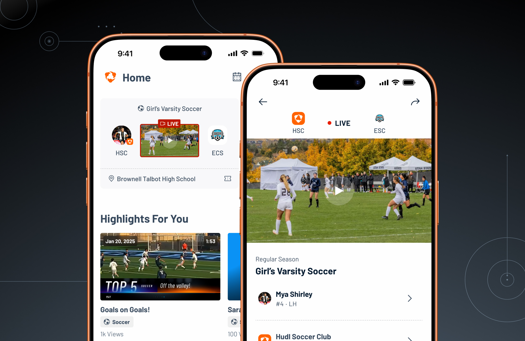
Hudl is a sports performance platform coaches, athletes, and administrators use for video, analytics, and team communication. This project designed Hudl's first product for parents, from scratch, with a paid subscription as the long-term goal.
Rather than ship it as a standalone 0→1 build, the project became the forcing function for consolidating two apps and rebuilding navigation for every role.
3 months after launch
- Unique parents
- 8,515
- Unique parents
- Videos watched per parent, monthly
- 25
- Videos watched per parent, monthly
- Sessions per parent, monthly
- 6
- Sessions per parent, monthly
- Successful sessions
- 95%
- Successful sessions
My Position
Sr. Product Designer
Tools
Figma, Miro, Claude, NotebookLM
Timeline
6 months → Spring alpha → Summer 2026 launch
The Challenge
A new user type, a mental model shift, and two apps becoming one
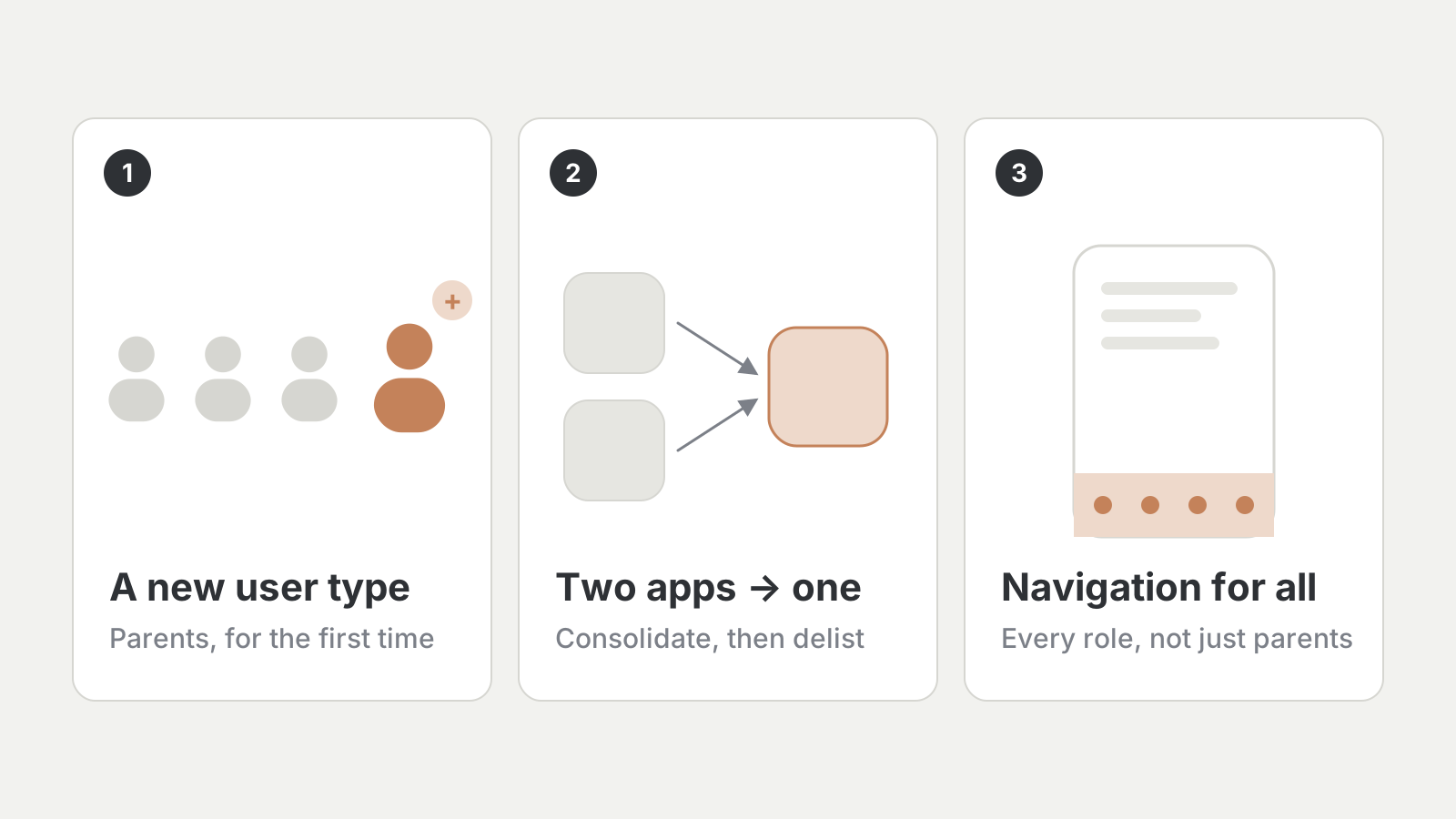
Parents had always been adjacent to Hudl — watching games, chasing highlights — but never had a product built for them. Launching one was also the moment to fix two problems that had been building for years.
- 1Define and validate an MVP for parents — groundwork for an untapped revenue line
- 2Consolidate two overlapping apps into one, delisting the duplicate and cutting its engineering overhead
- 3Fix a year-old navigation and information architecture problem across the whole platform
Summary
At a Glance
- 1Took a brand-new user type from zero to 8,515 parents in three months, averaging 6 sessions and 25 videos per parent each month
- 2Used pilot data to reframe the core problem as activation, not retention — and reset the roadmap heading into launch
- 3Led a navigation and IA fix that shipped for every role, and advised other designers to keep it consistent beyond this workstream
- 4Went past design files: merged real pull requests and built Claude Skills tooling for the wider team
Discovery
Discovery — Designing for a user who didn't exist yet
There was no parent research to start from. The first question wasn't what to build, but what job a parent is actually trying to get done — and how little of that could ship as a genuinely useful alpha. What did exist was a list of known problems in the legacy Fan app: empty schedules and rosters, unreliable livestream-to-replay handoffs, hard-to-find teams, and friction around purchases and refunds.
- 1
Two apps, one job
Parents bounced between two apps to get the full picture of their athlete's season — and sensed there was more content in Hudl's main app than in the fan app built for them. Consolidation mattered as much as any new screen.
- 2
A navigation problem a year in the making
Discovery kept surfacing a mental-model problem that had been flagged a year earlier and never prioritized. Going back through feedback from coaches, athletes, and admins made the case that this was a platform-wide fix, not a parent one-off.
- 3
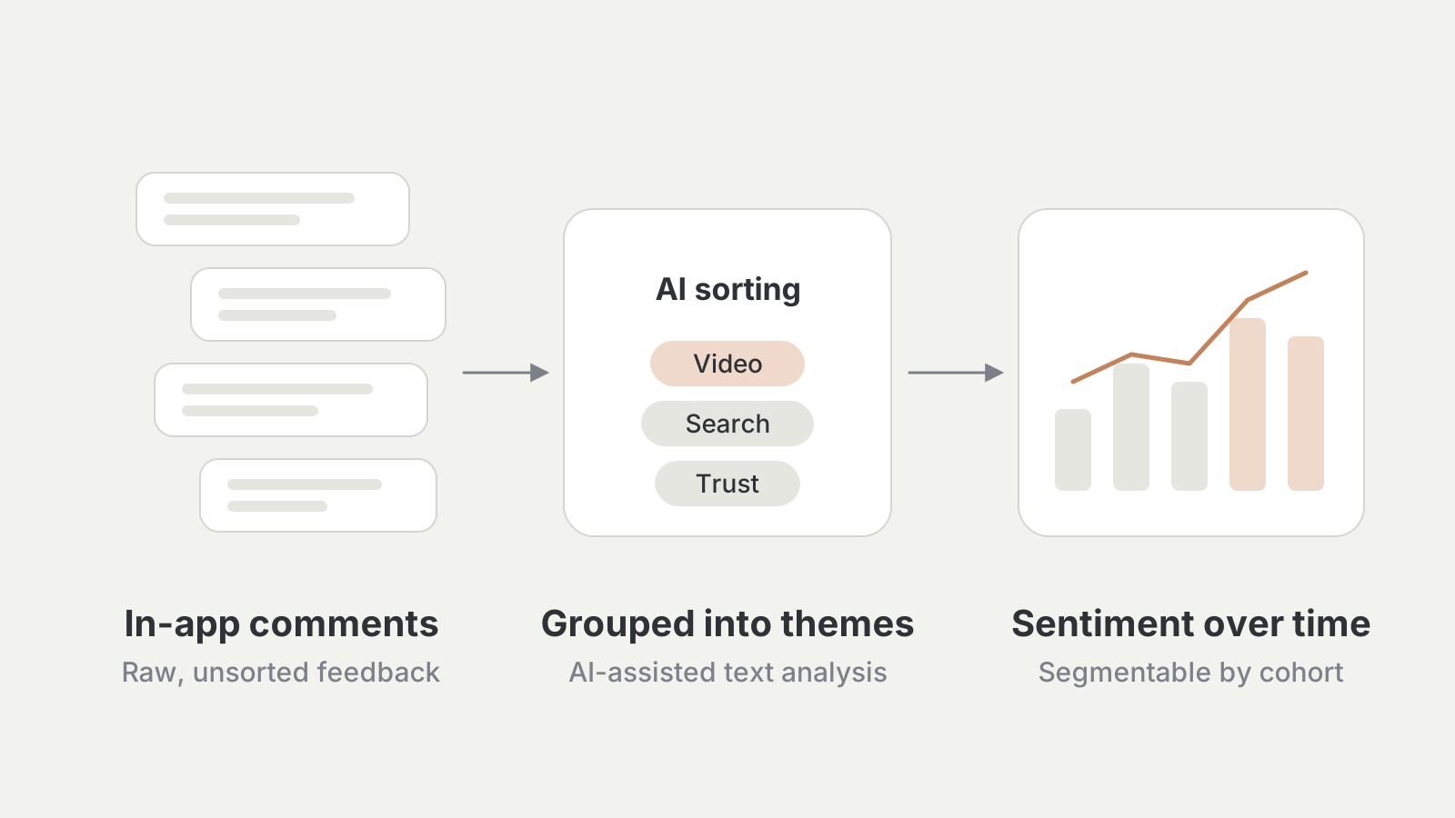
Turning feedback into signal
A pipeline on top of in-app comments used AI-assisted text analysis to sort raw feedback into recurring themes, feeding a sentiment dashboard segmentable by cohort. It replaced anecdotes with a repeatable check on whether new work addressed what parents cared about most.
- 4
What parents were running into
Parents expected far more video than existed. Teams were hard to find, pushing people into workarounds just to follow their own kid. Location and favorite teams weren't shaping what anyone saw first. And every team profile looked the same — what the team started calling "profile blindness."
- 5
Not breaking it for everyone else
The legacy app wasn't only for parents: coaches analyzed games there and recruiters browsed player profiles. Every change had to serve parents without quietly breaking those other jobs.
- 6
Built to learn fast
With so much unproven, the alpha was instrumented to learn quickly. For parent-facing features, that meant — production-fidelity prototypes, updated live on calls with families.
Strategy
Reframing the Problem
"...how might we bring an entirely new user type into Hudl for the first time, without asking every existing user to live with a fragmented, outdated foundation while we do it?"
The easy version was a new app for a new user, sitting beside everything else. The bigger opportunity was making the whole platform better in the process: one experience instead of two, and a navigation model that made sense for everyone.
Strategy
Design Strategy
- 1
Ship the alpha, then let it teach you
Instead of fully scoping the product up front, get a real version in front of real families early and treat the alpha as the primary research tool.
- 2
Fix the foundation once
Rebuilding navigation is disruptive, so it had to happen deliberately and once — designed to hold for parents and every existing role, not patched around the new addition.
- 3
Design the seams for monetization, don't build it yet
A future subscription shaped how flows and permissions were structured, without committing to paywalls or pricing before there was evidence of what parents would pay for.
- 4
Prototype in code, polish in code
put production-fidelity prototypes in front of parents, and hands-on carried polish straight into the codebase instead of a written handoff.
- 5
Leading beyond this workstream
The navigation changes reached surfaces this project didn't own, so part of the role was advising other designers to keep the fix consistent. The consolidation strategy was shaped through cross-functional sessions with product, marketing, and engineering — sequencing it around the parent rollout and keeping messaging honest about what shipped when.
Build
The MVP — Consolidation, navigation, and a new experience
- 1
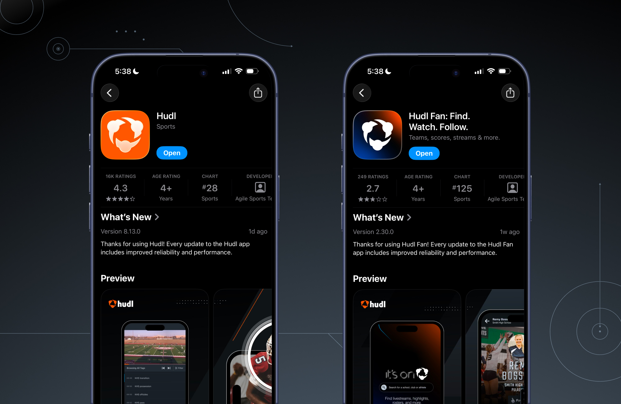
Merging two strong products into one
This wasn't folding a failing app into a stronger one. In the year before, the Fan app's NPS climbed from -5 to 30 and it reached #12 among free sports apps — ahead of Hudl's flagship at #30. Combining them ended the split attention, delisted the duplicate, and started the migration off its separate codebase.
- 2
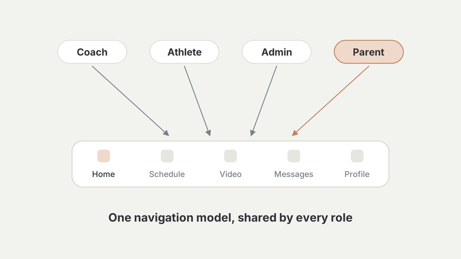
One navigation model for every role
The navigation and IA rebuild shipped platform-wide, resolving a year of accumulated feedback and giving every user type a clearer mental model of the product.
- 3
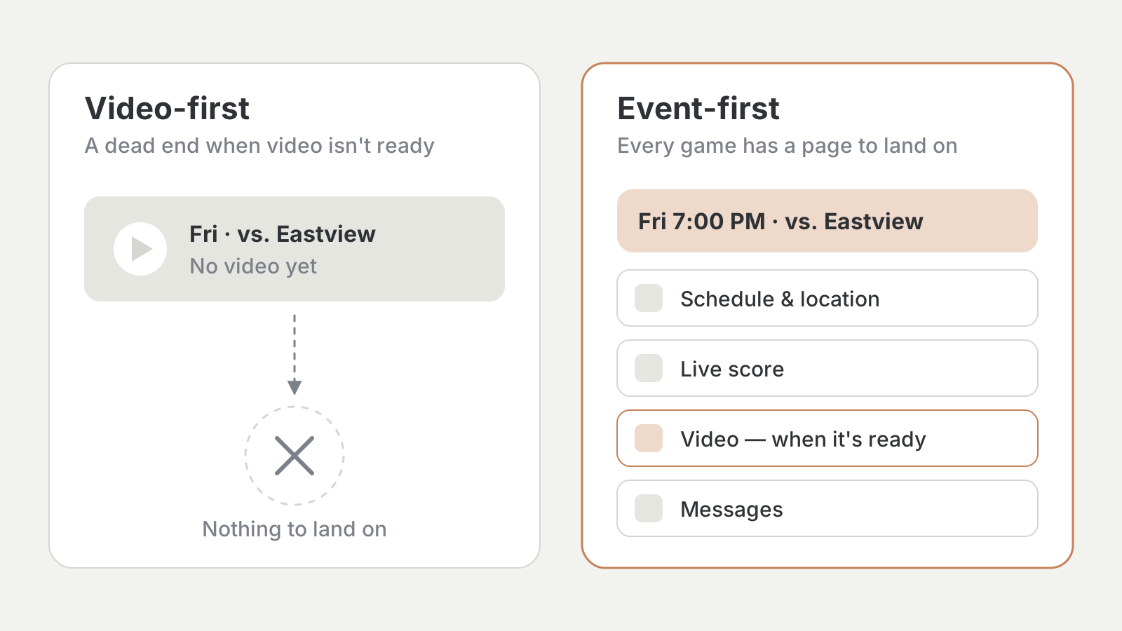
The cornerstone: design around the event, not the video
Parents plan their week around games, not around whether video exists. A video-first model dead-ended whenever a stream fell through or hadn't posted. An event-first page gave every game somewhere reliable to land — and a foundation for schedules, live data, and video to layer onto.
- 4
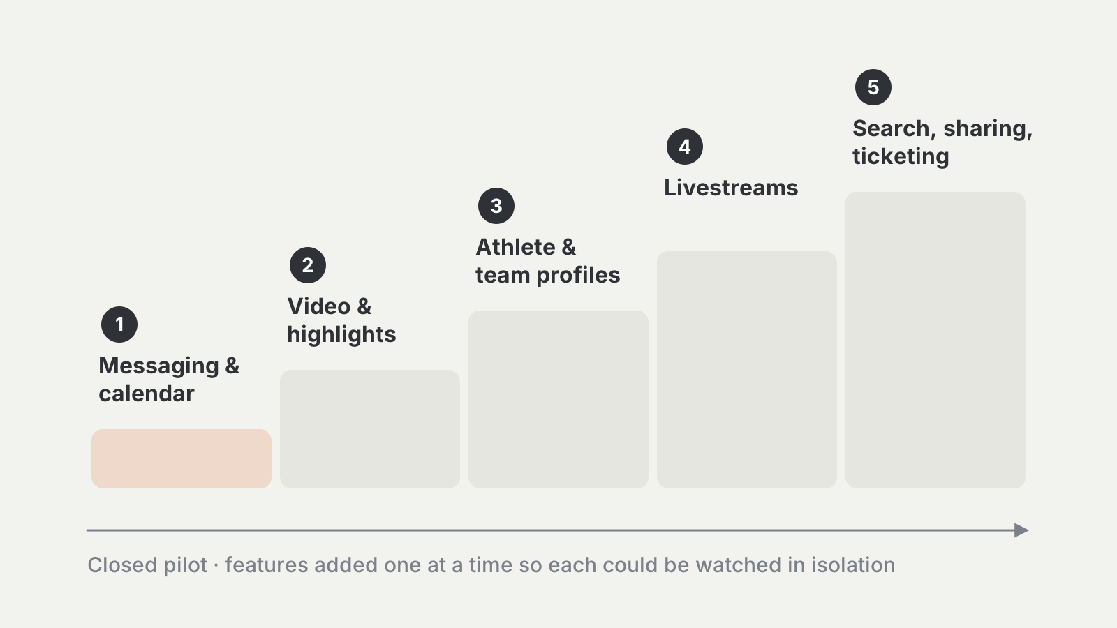
A closed pilot, built to be tested
The experience shipped first to a small group of real teams and families, with features added one at a time so each could be watched in isolation: messaging and calendar, then video and highlights, profiles, livestreams, and finally search, sharing, and ticketing.
Learnings
Alpha Learnings — Turning Data Into a New Point of View
"...the data wasn't telling us retention was broken — it was telling us most parents never found the experience in the first place. We weren't fighting a retention problem. We were fighting an activation problem."
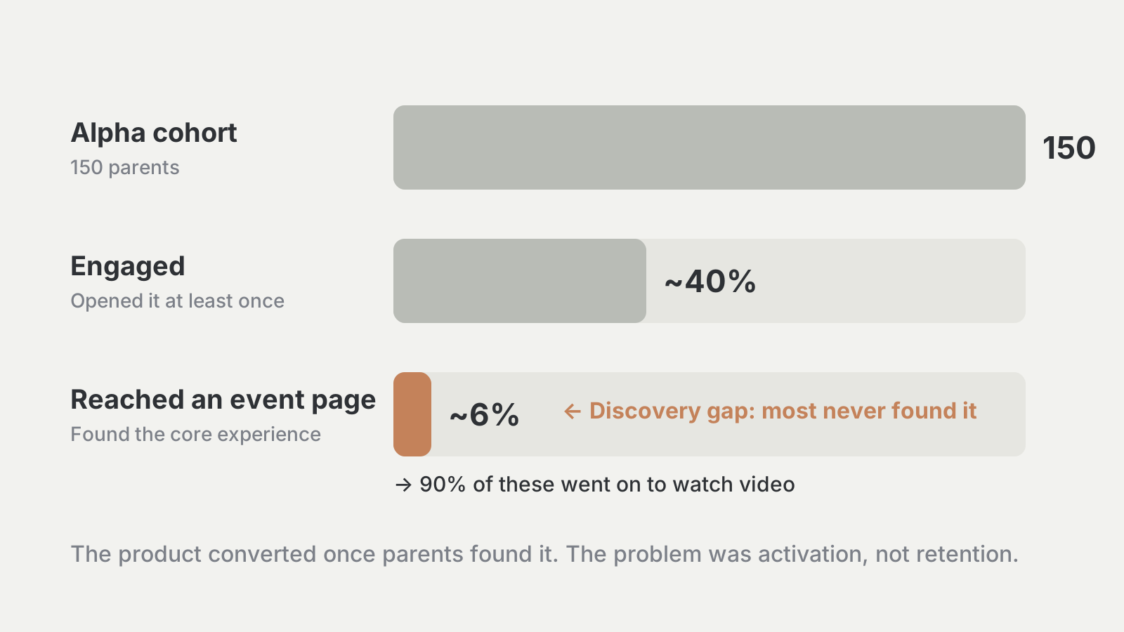
Across 150 parents and no marketing, about 40% engaged — and half of those watched video, validating video as the wedge into this market. Five patterns reshaped the point of view heading into launch.
- 1
Activation, not retention
90% of parents who reached an event page went on to watch video, but only about 6% got there. The product worked; discovery didn't. The next phase became about building activation into the product rather than relying on outside prompts.
- 2
The post-game moment is the hook
Email opens ran 42–50% against a 36.9% benchmark, but post-game sends drove about 4.5x the benchmark click-through while other reminders barely moved. That timing became the organizing principle for prompts back into the experience.
- 3
Parents want to create, not just consume
Parents wanted to clip, share, and export their athlete's highlights — some were already doing it through desktop workarounds. Creation turned out to be a core reason to come back, not a nice-to-have.
- 4
Trust before automation
Automated highlights were in high demand, but a missed moment or mis-tagged athlete undercut confidence in the whole feature. For something this personal, reliability has to clear a high bar first.
- 5
"Parent" isn't one audience
Coaches, team admins, and volunteer team managers each shaped adoption differently, with different levels of trust. Outreach and onboarding were rethought around those roles rather than treating every adult around a team the same.
90%
Event page → video watch rate
Parents who reached an event page and went on to watch video — the experience converted once found.
~6%
Reached an event page
Share of the full cohort that got that far — the bottleneck was discovery, not the product.
4.5x
Post-game email CTR vs. benchmark
Against the Braze benchmark. Pre-game sends drove almost no clicks.
Launch
The Launch — From 150 parents to thousands
General availability shipped in July 2026 on the new foundation — consolidation and navigation were already complete. The first week was quiet, with 78 parents. By the end of month one, about 4,400 had registered; by month three, 8,515.
A related feature released a month into the project opened a second door: an age gate requiring under-18 athletes to request parent consent brought about 600 parents through in its first week, connected directly to their athlete.
- Week 178
- Month 1~4,400
- Month 38,515
Milestones are unevenly spaced — bars show the cumulative total at each point, not equal time intervals.
Impact
The Impact — Three months in
The alpha left one question open: would parents come, and keep coming back? They do. The average parent returns six times a month and watches 25 videos — the video wedge the alpha pointed to, now holding at scale.
Next is rapid testing on what, specifically, this audience will pay for, with an engaged base of parents to test it with.
- 1New revenue line: 8,500+ engaged parents and real usage data for a previously untapped user type
- 2Cost efficiency: one app delisted and its separate codebase on the way out, freeing engineering capacity
- 3De-risked investment: demand proven with a 150-parent alpha before committing engineering spend at scale
- 4Platform health: a year-old navigation problem resolved for every role
8,515
Unique parents in 3 months
For a user type Hudl had never designed for.
25
Videos per parent, monthly
The alpha's video wedge, confirmed at scale.
6
Sessions per parent, monthly
Repeat use, not a one-time look after signup.
~6% → TBD
Reached an event page, alpha → today
Will show whether building activation into the product closed the gap.
#23 → TBD
App Store rank, launch → today
Among free sports apps at launch in July 2026, against where it sits with parents live.
2 → 1
Apps consolidated
Duplicate delisted, with its sunset underway.