Meeting business needs & iterating on user experience
Demandwell
Demandwell is a startup focused on helping customers grow their SEO organically. Their approach combines SEO expert consultation with platform automation, allowing the user flexibility depending on their own experience level. Mainly based in Indianapolis with around 50 employees.
Demandwell's approach to product provides the customer with a holistic software to improve SEO — supplying users with tools for keyword generation, content production, performance tracking, and site monitoring.
My Position
Lead Product Designer
Team
Ethan Grove, Tanner Brumbarger, Justin Stanczak, Jillian Howell & Matt McKee
Tools
Figma
Timeline
4 weeks planning, 6 weeks development
The Challenge
Ordering automation, visibility & better UX
This project stemmed from the high usage of their content product, the number of content+ customers, and the human-intensive need to service customers. The goal was to immediately impact cost-to-serve for existing customers and add assurances for customers interested in purchasing content production. The three main problems aimed to solve:
- 1Consultants were a bottleneck for communication & delivery
- 2Customers had no visibility on content progress after ordering
- 3Writers with lots of content struggled to stay organized
Kickoff — Evaluating & understanding current flows
It was key to understand existing flows to improve them and seamlessly add in the new offering. The end product would allow the user to manually produce everything or pick and choose what parts of the production process they'd like to participate in. By automating this within the product, the goal was to reduce cost-to-serve for this particular segment of customers.
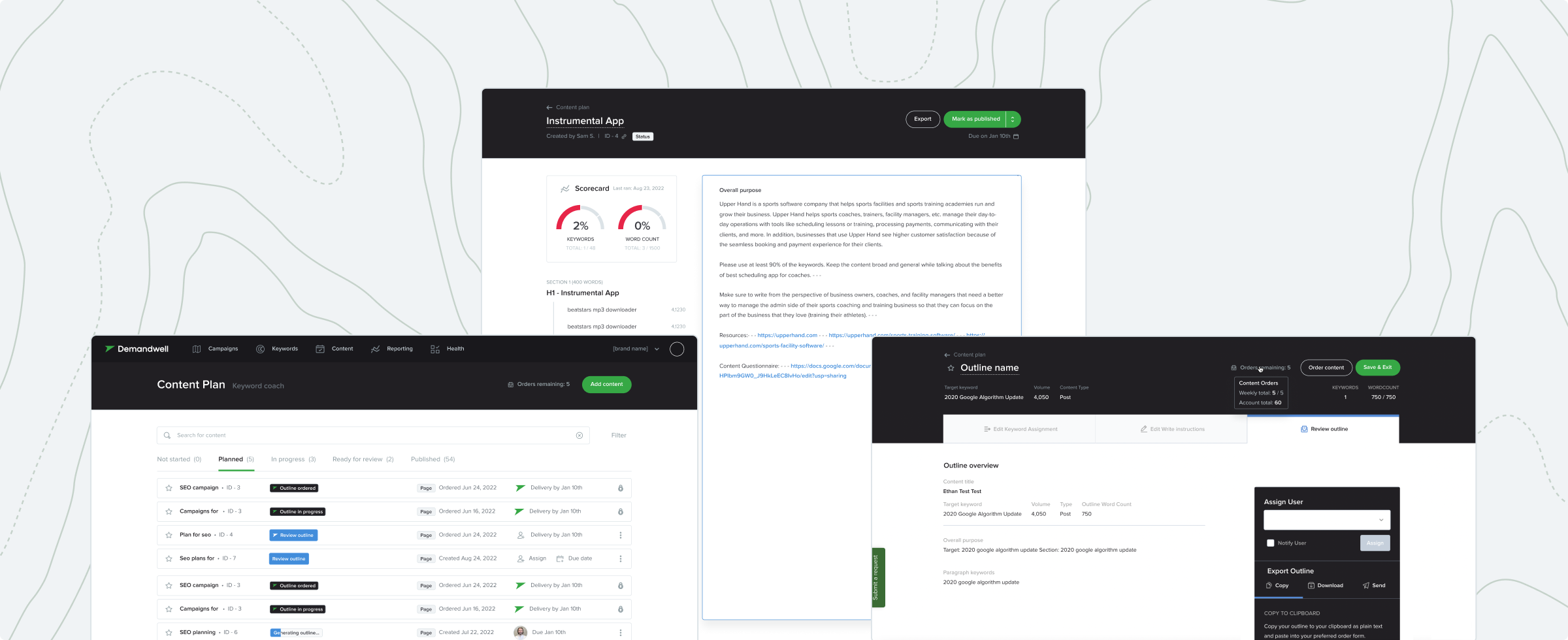
Within the Demandwell content production flow there are 3 main components — selecting keywords, building outlines, and writing content. These were self-service or purchasable through Demandwell. Selecting keywords and writing content were already add-ons, so the job was to fill the gap and allow premium customers to purchase content+.
Early Insights
- 1
Increase visibility and improve content quality
The new flow would provide another service through the product, and supply more defined statuses and approval steps to ensure the best output, eliminating complaints and possible rework.
- 2
Improvements must not disrupt current flows
With many users currently using the software, any changes needed to avoid disrupting their current content production process, and had to fit or improve the current backend structure.
- 3
Automation to improve scalability
Many manual tasks were performed by different teams to deliver services to the customer. By automating these tedious tasks (sometimes a bottleneck in the process), the goal was to reduce cost-to-serve each new content+ customer.
Discovery — All users and edge cases
The flows would be used by both customers and Demandwell employees fulfilling orders. With many users with different permissions and edge cases, the design needed to be simple yet complex — offering similar UI for each user with essential information and actions to complete various tasks.
- 1
Statuses & sections were unclear
With only three sections and limited statuses there was a lot of grey area that customer content could fall into during fulfillment. More in-depth sections and statuses would provide better insight into what part of the process an order was in without customers needing to reach out.
- 2
Improving existing internal processes
This project gave the company time to evaluate and improve existing internal processes at the same time.
Reframing the Problem
"...how might we serve the new customer base within the platform and make UX improvements for existing customers without disruption?"
After discovery it was identified that there were more areas for improvement while adding the new service offering. As lead designer, the goal was to explore all ways to improve the current offering in a non-disruptive way while fitting in the new offering with efficiency. This resulted in a slight redesign of the content planner list page and headers throughout the flow that contained key actions dependent on user permissions.
Design Strategy
- 1
Improvement of UX overall
Identifying key areas to make UX improvements for the existing and new customer base; now was a key time to iterate on the MVP product released years ago.
- 2
Increased ordering visibility
Statuses not being clear had to be addressed. Adding UX verbiage to clearly identify stages and more granular statuses would help visibility.
- 3
Eliminate internal work
With a lot of time being spent with a consultant communicating, more key actions needed to be put into the customer's hands to shift ownership.
UX Improvements & The New Offering
- 1
Clearer sections & less scrolling
Writers with lots of content struggled to stay organized within the Content Planner due to accordion sections containing various statuses. After release, the Content Planner was redesigned with new tabs, stages, icons, and tooltips for better organization and tracking.
- 2
New statuses & notifications
A lot of feedback indicated customers didn't have a clear way to understand the progress of their order. Along with clearer sections and statuses, Demandwell would now send email alerts to the user who ordered content as it progresses through writing phases.
- 3
Automating ordering & outline approval
New outline orders and approval were previously all via email. CPMs would create an outline, get it approved, and submit the order for the user. After launch, customers submit their own orders and approve outlines through the platform, eliminating unnecessary emails and time spent.
The Launch
Overall the project was a success. The new offering was delivered, visibility was increased, and UX was improved for all users. Positive feedback was received from customers and internal teams.
There were some speed bumps: the project started 2 weeks later than anticipated due to bleed-over from an earlier project, and a lack of communication between FE & BE engineers caused a few things to be missed. The team came together to determine what was vital to launch vs. what could go to a backlog for later.
The Impact
Positive results, keeping customers more organized and responsible for the ordering process.
The project had a positive impact on overall user experience and saved time for customers and internal members (at the time of writing, 3 months since launch). Daily active users rose due to the shift of order responsibility and progress notifications. Results were recorded 45 days after launch. After launch there were 2 additional weeks of continued work on fast-follows to continue improving user experience.
8%
Increase in DAU/MAU
70%
Increase of in-app orders
~10–15 min
Saved internally per order