Revamping & iterating an existing product for a new user audience

High Alpha x Pillar
High Alpha (HA) is a venture capital company that provides product leadership and other needs to start-up companies to speed up scalability. HA partners with a company — usually 3–6 months — providing thought leadership and design around product.
Pillar is a start-up focused on improving the interviewing process with unbiased decision making. Mainly based in Indianapolis — CEO on the east coast and other employees all over the United States — with under 50 employees. On this project the team worked with the CEO and about 10 other employees on a consistent basis.
My Position
Product Designer
Team
Ethan Grove, JP Pritzel & Pillar Team
Tools
Figma, FigJam
Timeline
~3 months
The Challenge
UX/UI overhaul including rebrand
Our goal for this project was to enhance the Luma product offering as a whole for the new user personas, while working through a rebrand — without constraining new ideas or innovations from being suggested or implemented. The ambition was to create a more user-friendly product with a strong foundation that embraced a rapidly evolving business.
- 1Update the platform to better reflect the new brand and user personas
- 2Create a platform that is easy to use & understand to encourage engagement
- 3Make improvements & innovations to existing UI and UX flows
Kickoff — Starting with the user personas
Before designing, the team needed to gain more insights about the new user personas. To learn more, they paired with the CEO, and occasionally the Head of Customer Service, to get a better picture of what each customer segment needed.
- 1
Defining what is first to work on
With a fully fleshed-out platform there were a lot of options for what to work on first. The team organized product offerings in a way that grouped them together logically, exposing gaps in the information architecture that needed to be filled or anticipated to be needed soon.
Early Insights
- 1
Design system needed updating
The design system in place was limited, but core functionality was there. Each component needed revamping due to the new brand. The team experimented with more intuitive UI components and flows while mixing in various brand elements to see what worked.
- 2
Functionality mostly there, but flows were not
Core functions of recording interviews and leaving basic highlights were available, but flows to bring that information forward to the user afterwards were difficult. There were also gaps within the Information Architecture that were skipped due to GTM reasons.
- 3
Most used vs. most important pages
Users spent most of their time on the interview page watching highlights, but finding specific interviews or highlights was a chore. Comparing candidates or interviews required having multiple tabs open. There were lots of opportunities to replace workarounds that current users had developed on their own.
Discovery — What is most important to the new user personas
- 1
Most used vs. most important actions
With new user personas in mind it was important to think through the key actions to get the user to their "aha moment" — letting the user naturally find value in the platform to create a helpful and sticky product.
- 2
What can a user do vs. what can a user see
Early on it was identified that there were three different customer personas to account for: Hiring Managers, Interviewers, and Recruiters. Within each role there are different goals each is trying to achieve. The team worked with the CEO and other stakeholders to identify high-level permissions and the key actions each user needed to complete their goals.
Reframing the Problem
"...how might we help interviewers and recruiters provide unbiased opinions to assist hiring managers in making better decisions?"
After the launch of Luma, it was discovered that the "user" the product was built for was incorrect.
The intended user was assumed to be the hiring manager, since they were in charge of making the final decision. In reality, the hiring manager has a handful of other duties and delegates their responsibilities a majority of the time if they have the resources. This resulted in low platform usage and negative mental perception of the product.
This begged the question: how might we help the hiring manager's resources provide unbiased data to help them make a better decision? This resulted in a redesign of current functionality and user flows tailored for interviewers and recruiters to provide perspective for the decision maker.
Design Strategy
- 1
Updating to the new brand
Updating the style guide and creating new components while also finding the best ways to implement brand voice and tone into the UX copy and UI elements.
- 2
Simplifying flows
The software needed to be intuitive, but also simple for the user. Eliminating unnecessary actions so the user could focus on the important tasks at hand.
- 3
Designing with empathy
All information on each screen had to be thoughtfully designed to the user persona that would be using it. Thinking through all edge cases that could happen.
The Redesign
- 1
Highlighting key moments with ease
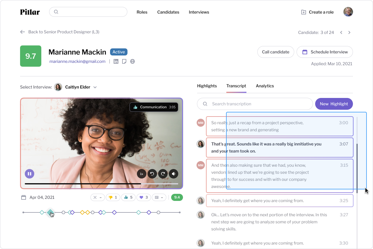
Being one of the most important tools, it was essential that gathering feedback during the interview process should be as easy as possible. Utilizing the existing Zoom integration, the team redesigned the user interactions of creating highlights, grading questions, and taking notes mid-interview.
- 2
Providing top candidates front and center
The roles page redesign included a candidate list with the top two candidates surfaced at the top based on the interview scoring system. This was intended to eliminate option paralysis for hiring managers who might only want to choose between the top two or three candidates.
- 3
Reducing friction on creating & sharing highlights
The first implementation of creating & sharing highlights post-interview were possible, but needed an upgrade. Allowing the user to easily grab certain parts of transcription or even just apply simple timestamped feedback while rewatching.
- 4
Analytics & innovation
After the core parts of the platform were redesigned and updated with the new brand, there was time to innovate within the interview decision space — working with analytics, dashboards, and any information considered useful to making better hires.
The Launch — Piece by piece for less disruption
Moving in a rapid iterative process, the team pushed updates in the smallest chunks possible — page by page, feature by feature, or flow by flow depending on the complexity and usage of what was being redesigned. Visual design was polished and functional details were improved as it was being developed. This process allowed users to notice updates in an iterative way, decreasing the chance of being overwhelmed.
The Impact — Positive results, but products are never finished
The redesign of the Pillar platform had a positive impact on purchasers and the interview experience as a whole. Due to the agency-like environment, the team was not able to stick around long enough to see or compare data after a reasonable amount of time.
Even though data was not collected, Pillar's updates have caused customers to leave amazing reviews about the improvements and the simplification of a very mundane and biased process. Pillar continues to climb in popularity and win more tech awards.
X%
Increase in DAU/MAU
↓X days
Time from first contact to hire
↑X%
New hire retention